9th January, 2026
8 min read
Children's Book Cover Trends 2026: What's Going to Dominate the Shelves?
Written by:
Hannah Cather
There’s something very powerful about a good book cover and its eye-grabbing way of catching a reader’s attention. Because think about how hard that really is these days… when eyes are superglued to screens, and when really-really-great front cover designs are not the exception. Indeed, there are so many good covers in the book market – that huge and super-saturated place that just keeps growing and giving. Shelves are literally sagging under the weight of marvellous covers. Bad ones, too, of course, but so many good ones. And that’s why when an amazing cover manages to grab a glance from a wannabe reader, it’s impressive. Magic. Defying the odds. And even more so for children’s books, whose little readers often rely so much more on the illustrations than the words.
But what makes a good cover? And especially so now, in 2026? A strong way to start is by reviewing the cover tropes and trends that are shining at the moment. These trends constantly evolve and change, just like flimsy fashion and in-vogue bits and bobs. But they are trends for a reason and it’s very important to research what’s current in the cover sphere.
Hopefully this blog will help with your research. So, take a seat, take a look, take notes and inspiration from these 2026 children’s book cover trends.
The Soft Touch
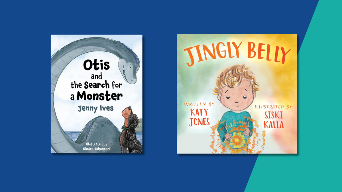
We’re going back to basics here. This trend appears hand-drawn and hand-made (regardless of whether it’s been created traditionally or otherwise), with a lot of love thrown into every brush stroke or pencil line. Characters look fresh off the page of a well-used sketchpad, and have simple details, an authentic look and a sweet, warm style. There might be signs of pencil marks, loose and lovely cross-hatching, paper textures as backgrounds, watercolour blobs, and little perfect imperfections. Covers in this softer style are magic because they sweetly amplify the artistry behind the final image. We are able to see evidence of the illustrator’s sketching and doodling and process, rather than an ultra-luxe, highly finished piece. It’s a heart-warming style. Troubador’s Jingly Belly is a wonderful example of this.
See:
The Magic Feather – Julia Donaldson and Catherine Rayner (March 2026)
Bear and Bird: The Cloud – Jarvis (February 2026)
Dark and Dreamy
Children’s covers in this style have a deep, dark magic to them – and that’s meant in the best possible way. They play wonderfully with light and shade, and, crucially, they are not afraid of adding plenty of darkness to a children’s book cover – using gloomy backgrounds, mysterious silhouettes, night skies. Characters don’t need to have huge smiles, either – they can show emotion, be hidden in shadow, be at the start of a journey and unsure, rather than at the end and full of joy. The reason that darkness adds so much is that it offers up a mystery to the reader, drawing them in with the promise of real adventure, good and bad, dark and light, up and down. This look also works amazingly well within the realm of young adult literature, where the light and shade that is so often present in the text is reflected onto the front cover.
See:
The Lost Robot – Joe Todd-Stanton (March 2026)
The Monsters at the End of the World – Rebecca Orwin and Oriol Vidal (January 2026)
Big and Blobby
Yes, that title is correct. This style is large and loud and so proud. It’s abstract and bold, and the characters usually take up a heck of a lot of space in their blob-like, basic forms. This is not said negatively. The simplicity and basic look is undeniably and – in every possible way – eye-catching and attention-grabbing. Backgrounds tend to be either stark white or a bright colour – anything to make the images pop even further off the page and right into the readers’ laps. Characters often make use of quirky make-you-giggle expressions, and covers are set-up to a very simple formula: crazy-fun title font, striking background, big bold in-your-face characters. Job done. Less is more, after all. This look has huge appeal to lots of ages – it’s a fitting style for little ones, who like bold, bright artwork, and it’s a humourous style for slightly older readers, who love the non-realistic, fun looks being thrown around the page.
See:
Rock and Roll – Ruby Amy Thompson (February 2026)
It’s Not My Cookie – Kael Tudor and Ben Sanders (January 2026)
White-Space Winners
Just like the blobby cover trend above, white-space covers prove that the time-old adage of ‘simple is best’ is true. White space basically means that the cover is predominantly made up of, well, space that is white. These are covers with a lot of room and starkness, allowing the illustrations that are on the page to breathe, to expand and to shine fully. Authors will sometimes make the mistake of cramming their covers with details, embellishments, bells and whistles, but often, more harm is done in these jam-packed images. Characters, action points and titles get wildly lost, the readers’ eye is overwhelmed, and the busyness just serves to dilute the message that the cover is trying so hard to portray. In contrast, white space means crystal-clear clarity, space to think, and a tone of calmness. Don’t be afraid of white – it will do more and bring more than you ever thought possible.
See:
Bath Time for the Crayons – Drew Daywalt and Oliver Jeffers (January 2026)
Raindrops – Robin Boyden (February 2026)
Mo’s Stick – Fiona Lumbers (March 2026)
Limited Palettes
This is the cousin of the white-space trend. A cover with a limited palette acts on the less-is-more theme, but slowly and carefully injects moments and splashes of colour to the artwork. Usually, the artist/designer will pick a capsule palette that will not be deviated from at all throughout the book. This palette becomes the book’s uniform – perhaps comprising three perfect, bespoke colours that pick up and pop out certain aspects in the otherwise monotone artwork. Again, it’s the magic formula of ‘show less, get so much more’. The impact of limited palettes has the power to skyrocket your children’s front cover design. Troubador’s very own Jamie and the Smelly Welly is a lovely example of this.
See:
Squirrel and Bird – Laura Baker and Stacey Thomas (October 2025 – last year, just, but so worth a look).
Emerald and the Sea Dragon – Harriet Muncaster (March 2026)
Enormous, Expansive Nature
Look around any bookshelf of children’s titles and you’ll glimpse nature in so many of them. Whether that means backgrounds showing wild seascapes and humming jungles, or trees rising to the top of the page, or thorny rosebushes in fairy tales, or colour schemes that take inspo from the sky (sunrise to golden hour to twilight to sunset), or animals freely roaming the page, nature will never let a cover down. Children love it because they recognise things to see, smell, hear – nature provides a tactile, knowable experience for them. It’s also just plain beautiful. Go big with nature artwork, cover the cover, make it wide, expansive and breath-taking. Or go smaller – floral embellishments, tangly foliage around the edges, a tree canopy above the title. This is a very adaptable and evergreen trend. You can’t go far wrong. Troubador’s beautiful Otis and the Search for a Monster fits this trend well.
See:
Isla and the Sky – Gregg Stobbs (February 2026)
Once I Was a Giant – Zeno Sworder (January 2026)
The Brave Little Whale – Charlotte Manning (March 2026)
And speaking of evergreen trends, it’s also good to have an idea about cover elements that will always work. These are elements to keep in mind today, tomorrow and forever, regardless of the cover trends that may or may not be dominating the children’s book market at a certain time.
Evergreen tips for children’s book covers:
They are character-led. Pop a character on there. This personalises the book and invites readers in. Even if it’s just a hint of a character – a shadow or an object left behind.
Don’t crowd the page too much. The best looks tend to be the less-busy ones. And there are many stages to this (from a white-space wonder to a decorated cover that isn’t OTT).
Always have the reader in mind. Who are you hoping to attract? What will grab the eye? What is interesting and amazing to your target readership?
Think about how your cover text works with the illustration (fyi, cover text = book title and author credit). Make it seem like the text was considered from the beginning, rather than looking like a slapdash ill-fitting afterthought.
Conclusion
Cover trends are a funny dichotomy. On one hand, they might seem limiting – as though they are stopping you from thinking too far out of the (paint)box – but on the other hand, they can provide humungous inspiration and a guiding hand that keeps you safely inside the lines of current looks, colours and styles. There’s such an important balance between standing out from the crowd by enough, but also being able to fit snugly into the bookshelf space around you, online and offline. But let’s face it: trends are trends for a reason. And adhering to them can help you to create unbelievable covers that are far more likely to sell and also look incredible.
Hopefully the above cover trends are a guide for any authors making their first steps into choosing a front cover design. These trends are looks that you should be keeping a close eye on, so that (in return) you’ll be able to get eyes – so many eyes – on your own children’s picture book in 2026.
The Troubador team are here to help authors in any way that we can with no obligations, so please feel free to reach out to us if you have any questions. If you need illustrations for your book cover or interiors, Troubador has a brilliant illustration service to help you find the perfect artist to fulfil your vision. We’ll look forward to hearing from you – paintbrushes, pencils and plans at the ready! Contact Hannah at illustrations@troubador.co.uk.
About the Author
Hannah Cather
Editorial and Illustration Controller
With over a decade of publishing and project-management experience, Hannah has helped to bring all kinds of books to life, including children's picture books, fiction novels, coffee-table tomes, self-help guides and more. At Troubador, Hannah splits her time between editorial (undertaking copy-edits and proofreads) and illustration (working with artists and authors to achieve beautiful illustrations). Outside work, Hannah enjoys family time, walking and (predictably) reading… or as much as four children allow!