
7th August, 2026
6 min read
Can I Typeset My Own Book?: Typesetting Tips for Authors

Written by:
Carolina Santos
Two of the key reasons self-publishing authors choose this route to publication are freedom of choice and control, but it also means getting to grips with some concepts and industry lingo. And whilst everyone knows the importance of strong cover design, we cannot underestimate the importance of the inside of the book and, with that, the typesetting. As production controllers, typesetting is something we do everyday, and when we talk with aspiring self-publishers they will often ask us an array of questions, including: what does typesetting entail, what a typesetter must consider, and whether an author can typeset their own book, or if they should opt for a professional. So, with that in mind:
What is Typesetting?
The oversimplified definition is exactly what it sounds like: setting type. However, typesetting is a craft as old as Gutenberg's press, with its own set of canons and rules. It involves arranging text and images for both eBooks and printed formats to ensure a readable, pleasant layout. A typesetter will pay attention to minute details, such as ensuring consistent spacing throughout (line spacing, letter spacing and margins), and will select fonts that suit the book’s genre and target demographic. You may not yet know what goes into it, but I’m sure you’ll notice when it has been well done, or not so much. So, next time you’re enjoying a good book, take a moment to appreciate the artistry of typesetting.
What Do You Need To Consider?
Typesetting your own book can be a steep learning curve and a fulfilling task in equal measure. On the one hand, there are many technical details to get your head around; on the other, it’s another part of the process which will bring your book to life. So, here are a few key pointers a self-publishing author will need to consider before typesetting their book:
Professional Typesetting Software
It’s important to invest in professional typesetting software, such as Adobe InDesign, to format your book. Avoid using word processors like Microsoft Word or Pages for complex book layouts, as they are not designed for this purpose.
Print and eBook Formatting
Printed books should be typeset to their size and format, in accordance with the printer’s particular specifications. Keep in mind that formatting for print and eBooks can be different. Ebooks may require special formatting for reflowable text and might not support all the design elements used in print books (such as particular fonts, decorative elements, etc). When typesetting, particularly an eBook, consider accessibility by enabling text magnification, changing background and font colours, supporting text-to-speech tools and working with assistive technologies.
Page Size and Margins
Choose an appropriate page size for your book. For example, most paperback fiction titles in the UK tend to be B-format (198x129mm), with some exceptions. Larger book sizes are normally used for hardbacks, non-fiction or books with long word counts (think War and Peace). Set consistent and appropriate margins for the top, bottom, inside (gutter), and outside edges of the pages to ensure readability and aesthetic appeal. Although wide margins may be great for notetaking on textbooks, narrow margins make for a cramped look and an unpleasant reading experience. Margins allow room for your words to breathe and prevent your readers’ eyes from feeling overwhelmed.
Font Selection
Choose legible and book-appropriate fonts for the body text and headings. Commonly used fonts for body text include Garamond, Minion Pro and Caslon. Heading fonts can be quite impactful, and a great opportunity to use a different font style that ties in with the book’s genre and cover. For example, thrillers tend to feature bold sans serif headings (when the letters don’t have their strokes, like this one), and children’s books often use more whimsical fonts paired with simpler, easy-to-read body fonts. Ensure the font size and line spacing (leading) are suitable for readability, and that you have the correct license to use that font in a book (many fonts are free online, but check if they’re free for commercial use too).
Hyphenation and Justification
Set proper hyphenation and justification settings (justification aligns both edges of a line with the margins) to avoid large gaps between words and awkward line breaks. It’s uncommon for books in English to have many words broken up by hyphens at the end of a sentence. A professional look and feel are achieved by minimising widows (single words at the end of a paragraph) and orphans (single lines at the beginning of a new page or column).
Consistent Styling
Maintain consistent formatting throughout the book. Use the same fonts, font sizes, and spacing for headings, subheadings, body text, and other elements. Establish a style guide for your book and stick to it.
Page Numbers
Add page numbers to your book, typically in the footer or header of each page. Ensure they are consistent and follow the proper sequence (e.g., Roman numerals for the front matter and Arabic numerals for the main text). For reference, all right-hand pages are odd-numbered, and all left-hand pages are even.
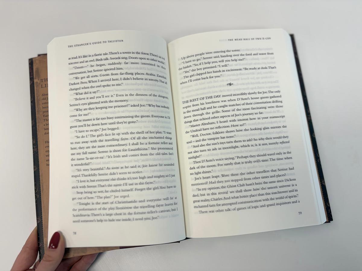 Each typesetting choice, from font to space to running heads, shapes a reader's experience of your book. Opting for a professional typesetter can ensure that the typesetting is not only smooth, but enhancing a reader's experience with your book.
Chapter Openings
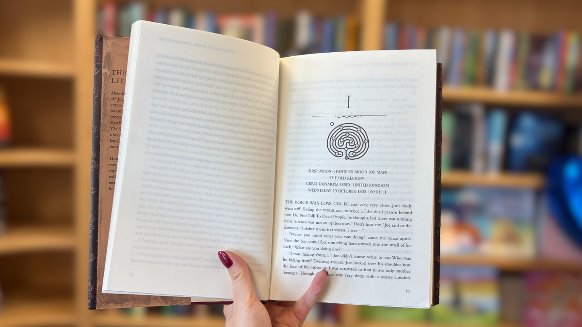
If your aim is to design visually appealing chapter openings, you may want to include drop caps, decorative elements, or a specific style that distinguishes them from the rest of the text.
Images and Graphics
If your book contains images or graphics, ensure they are high-resolution and properly placed and anchored within the text. To reproduce well in print, images need to be at least 300DPI (dots per inch) and in the CMYK colour profile (cyan, magenta, yellow and key, which is another word for black). If budget is a concern, think about only including black & white (greyscale) images, to save on printing costs – each colour page will impact the cost of printing. Pay attention to the placement and captioning of figures, and keep spacing and styling consistent, whether around images or tables.
Paragraph and Line Spacing, Widow and Orphan Control
Adjust line spacing, also known as leading, to make the text comfortable to read. Adequate paragraph spacing is essential for readability and aesthetics. Use software settings to control widows and orphans, ensuring that paragraphs don't start or end with a single line at the top or bottom of a page.
Running Headers and Footers
If it suits the genre, you may want to add running headers (often chapter titles) and footers (often book titles or author names) to increase the professional look of the layout.
Indexing
Now, this may not apply to every book, but it’s certainly invaluable for many non-fiction titles, as indices guide readers to a specific topic and help establish authority within the subject at hand. If this is something you’re interested in, we recommend reading THIS blog post on the best route to an index.
Proofreading and Testing
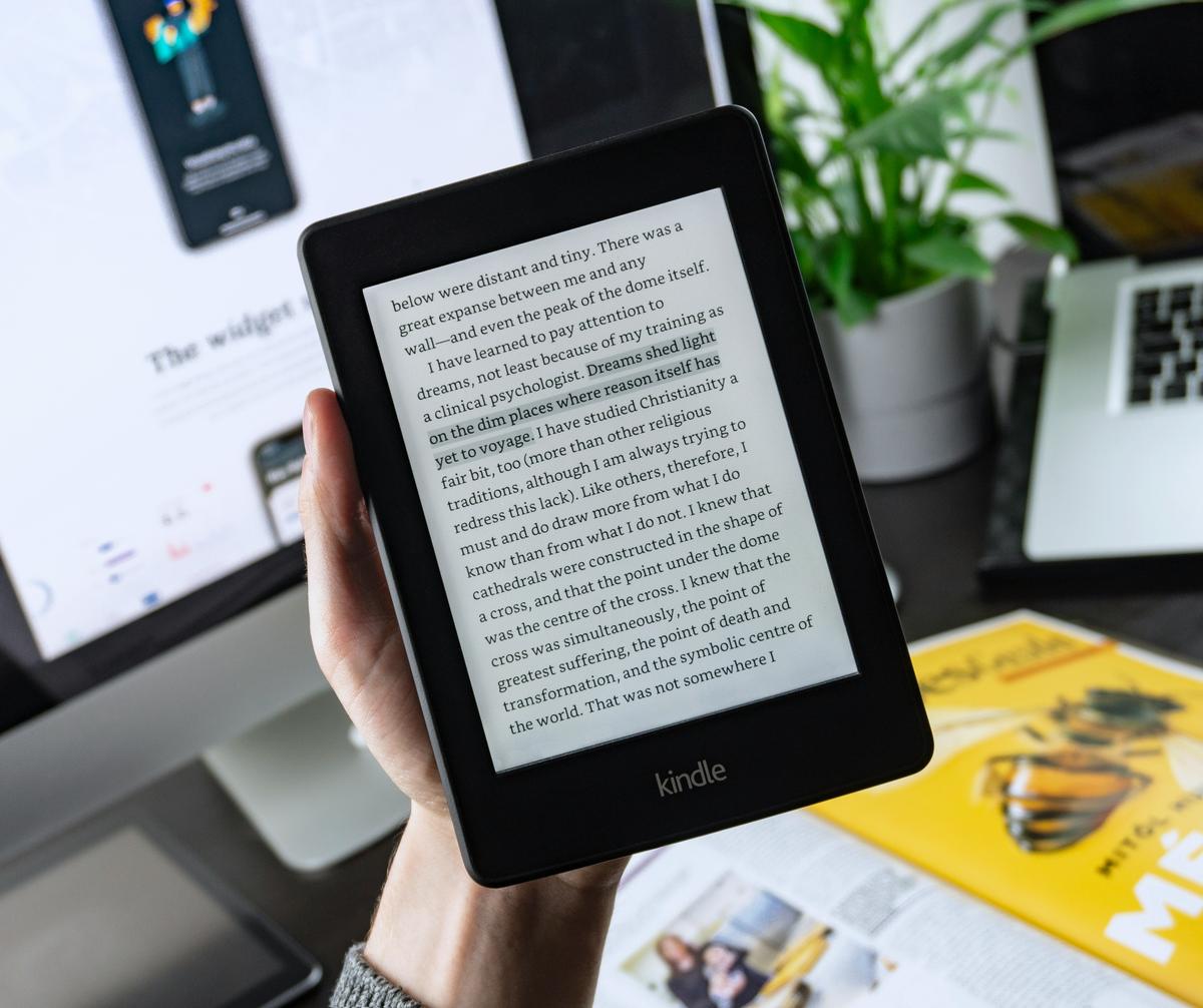
After formatting, thoroughly proofread your book to catch any formatting errors, typographical mistakes, or layout issues. Once again, try to ensure consistency of spacing and style throughout. Test your book on various devices and formats (e.g., Kindle, ePub, PDF) to ensure it looks good, reads well and functions correctly.
Where professionals can help
Typesetting can be quite minimalist or very intricate depending on what you are trying to achieve and the content of your book. Typesetting is often viewed as secondary to cover design, but in some ways, it is more important as it can impact the way readers absorb and read your self-published book. After all, we, as readers, spend longer looking at the inside of the book than the cover. Remember: a well-designed book enhances the reader's experience and can make your work more appealing and credible. A polished and professional appearance will ultimately set your self-published book apart from the competition.
If the topics covered feel daunting, and you don’t fancy becoming a technical wizard on typesetting software, you may want to consider passing this task on to a professional. We specialise in bringing books to life, and what happens during Production is what will eventually lead to a beautiful book which you can proudly hold, and readers can enjoy. At Troubador, we offer a full typesetting service to self-publishing authors, as part of the Production process, which includes a bespoke style proof and print file checks. We always use industry-standard software across all departments, but if you wish to put your skills to the test, we also offer a print-ready file check to ensure what has been produced meets our specifications and those of the chosen printer.
About the Author
Carolina Santos
Senior Production Controller
Carolina graduated with a first-class degree in Creative Writing and Journalism and, soon after, started her publishing journey as an intern for Indie Books. In the past, she also managed an independent bookshop, curating varied stock alongside delivering excellent customer service to her local community. As a Production Controller, she guides her authors through the production process as swiftly and smoothly as possible. Carolina enjoys a gritty memoir and getting her hands stuck in clay in her spare time.