24th February, 2025
7 min read
Type It Right: How the Right Font Can Elevate Your Book Cover
Written by:
Chloe Messinger
Now, before you internally yawn at the thought of reading a post about font choice, ask yourself this: Do you know what fonts suit the genre of your book? Or are certain fonts specifically used for certain genres for a reason? If the answer is no, then you may want to keep reading…
So many times, I’ve heard authors say to me, ‘Look at this - this is the font I want to use on my book cover!’ but there has been little consideration as to whether that particular font will suit the genre of the book. A font may look pretty, but there’s so much more to selecting a font than your preference.
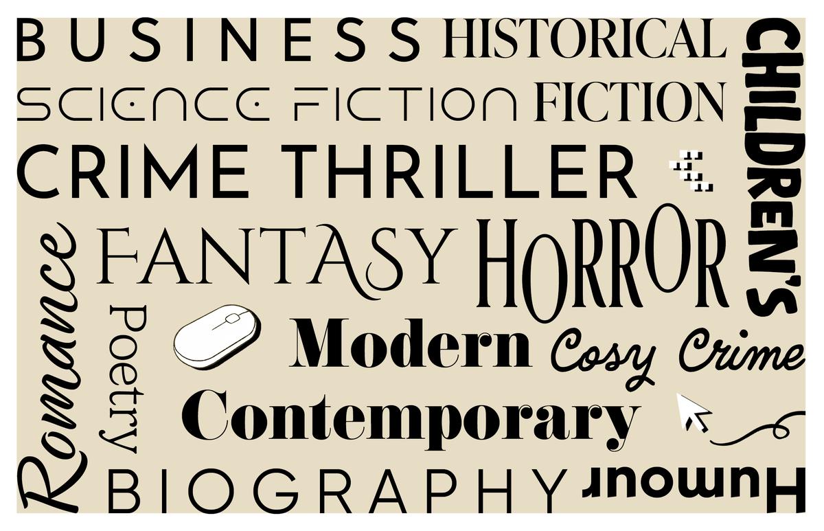
Fonts Define the Genre
Fonts are just as important to consider as the imagery and colours for your book. If you look at classic crime thrillers versus cosy crime, for example, you will see a noticeable difference in the fonts chosen for these two genres.
For example, Richard Osman’s The Thursday Murder Club book cover features script-like fonts and warm, inviting colours. The text on cosy crime covers also tends to be more playful, successfully evoking a ‘cosy’ feeling.
Compare the above to Lisa Jewell’s ‘None of This is True’ cover, whose title is in a sharp, sans-serif font accompanied by shadow and much colder colours. Fonts with sharper edges and a colder colour scheme can create a sense of urgency and menace. This suits the book’s crime thriller genre perfectly, setting the tone for a darker, more serious read.
There is a clear difference in genre between these two books, as evidenced by their use of colour, imagery, and font.
Consistency
The font should reflect the essence of the genre. For example, a historical fiction novel might use a font inspired by the period, while a modern fantasy novel might use a more decorative or contemporary font. The font choice can subtly communicate readers' expectations regarding the setting, narrative style, or themes.
Target Audience
Font choice can also speak to the book’s intended readers. Books for children, for example, may use whimsical or playful fonts. In contrast, books in more professional categories, such as biography or self-help, may showcase clean, simple fonts which help to convey clarity and authority. For horror, you’ll often see fonts that appear eerie, disjointed or manipulated in a creepy way. They usually look unsettling and help to hint at something ominous within the story. The font may be more creative and painterly for more artistic genres, such as poetry, but still easy to read.
The Art of Impact
A font can directly affect the emotions of the reader. A story involving a tragedy may use a font that looks distressed or fragile, while a comical book could use something fun and playful.
Romance
Current romance novels show a mixture of pretty, script-like and elegant serif fonts, giving a sense of beauty and nostalgia. Soft, rounded letters often evoke warmth and elegance. To understand the feelings fonts can create, you can compare this to the sharper-edged, colder-looking sans-serif fonts in crime thrillers.
There are, of course, many cases where romance books aren’t always light-hearted and playful. Sometimes, they have darker themes covering topics such as coercion, manipulation and abuse. The font choice is important to show a story’s more serious tone. Colleen Hoover is a hugely popular author of typically darker romance fiction. If you look at many of Colleen Hoover’s book covers, you’ll notice a narrow, sans-serif font is used across most of them.
As mentioned before, sans-serif fonts are most popular in the crime genre. So, Hoover's use of a similar font on her romance covers allows customers to view her books as darker than your typical romance novel. The font choice here cleverly suggests that the book has darker themes while still showing that it fits the romance genre through delicate yet broken imagery.

Size Matters
One thing that stays the same across all genres is the size of the text on the cover. Scaled-up, big, clear titles are in, while small titles that take up one or two lines are out. One main reason is that we now live in the world of online shopping, one of the most popular and fastest ways to buy a product.
When advertising a product online, though, what size is the product's image most of the time? You guessed it, no bigger than the palm of your hand, often referred to as ‘thumbnail size’ in the publishing industry. This is one of the main reasons big titles on covers are on trend and so important.
If you’re looking to make sales, one thing that will certainly hinder that sale is the lack of readability at thumbnail size. If a customer is browsing on their phone and comes across a cover with a title in a small font size, it likely won’t catch their attention, and they’ll keep scrolling.
Of course, colour choice and impactful imagery play important roles in the design of a book cover, but font size is equally important and should not be overlooked. This applies to physical books in bookstores, too. If the text on the cover is small, particularly the title, it will be overshadowed by all the other books in the shop whose covers display larger, more eye-catching text.
Fonts Age
Like many things, fonts get old and go out of fashion. When computers became more of a common household item in the 1980s - 1990s, fonts such as Times New Roman, Harrington, and, dare I say it, Comic Sans, to name a few, were very popular and used across books, games (both online and offline), posters and more. Of course, there are fonts such as Copperplate Gothic, which date much further back than that. With increasingly easier access to computers and the internet from then to now, the invention of different fonts has exploded exponentially. There are thousands to choose from!
If you visit your local Waterstones, you’ll notice that fonts such as Times New Roman, Copperplate Gothic, and others from earlier eras are not typically used on covers now, as font trends (yes, font trends!) have changed so much since then.
With font trends continuously growing and changing, older fonts naturally become a thing of the past and don’t fit in with the modern look of book covers today. This is where the insight and advice from a professional cover designer who works in the ever-growing and changing industry can be key to creating an eye-catching cover that looks like part of its genre.
A professional designer can advise you on the best font choice (or choices) for your book cover, depending on the genre, and help create a cover that retailers will want to sell and customers will want to buy.
The Merging of Genres
There are many books out there where the lines get a little blurred as to what genre the book sits in. Perhaps it’s a story about a crime, but it also sits within the modern contemporary genre and doesn’t suit cosy crime. This is where looking at font trends in the few genres the book falls into is important to giving the book the right look. Again, reaching out for expert advice from designers in the industry can be super helpful here, as they will have a strong understanding of what’s current for all genres. They will be able to create a cover tailored to your story and align it to the correct category.
Where Words and Images Collide
When text and imagery interact on a cover, they create a relationship that goes beyond the basics of simply displaying information. When they interact together creatively, it can intrigue a customer to pick up the book and want to find out more. The font needs to work with the cover imagery rather than separate it so that all elements create one unified piece of artwork. The cover is the first thing a potential reader sees, therefore the choice of fonts and imagery that work well together and work well for the genre is crucial.
That’s a wrap
Fonts help to categorise a story into its rightful genre. Of course, imagery, colours, textures and layout all play a huge part in the design of a book cover and which genre it appears to fit into, but the text can often be an afterthought when, really, it should be at the forefront – seeing as it will be on the book cover.
I’ve covered only a tiny selection of genres in this blog, but hopefully, from these few examples, I’ve shown how the choice of a font is so important in relating to the correct genre. With over fifty categories, you can imagine how important it is to ensure a book cover is tailored to fit the right genre and attract its intended audience.
Ultimately, the right font will grab the customer’s attention, set expectations, and align with the story’s atmosphere, helping to pull the reader into the book even before they read the first page.

About the Author
Chloe Messinger
Designer
Chloe joined Troubador in 2023 after gaining a Bachelor Honours in Graphic Design and Illustration, and a Masters in Children’s Book Illustration. She loves to get immersed in the creation of a book cover, from children’s fiction to philosophy, to fantasy, crime and the rest. The more variety the better. When she’s not busy designing, you can find her out hiking in mossy woodland, swimming, paddle boarding, drawing or buried deep in a good book.