3rd September, 2024
8 min read
The Top 5 Things All Authors Need to Know About Book Cover Design
Written by:
Chloe Messinger
Reviewed: January 2026
When it comes to book cover design, there are many factors to take into consideration. Who is your target audience? Do you know your genre and what the current look for this is? How will you explain your cover ideas to a professional designer? The answers to these questions may seem obvious at first, but when thinking more deeply into it, you may find this article rather useful in guiding you in the right direction.
Know Your Genre
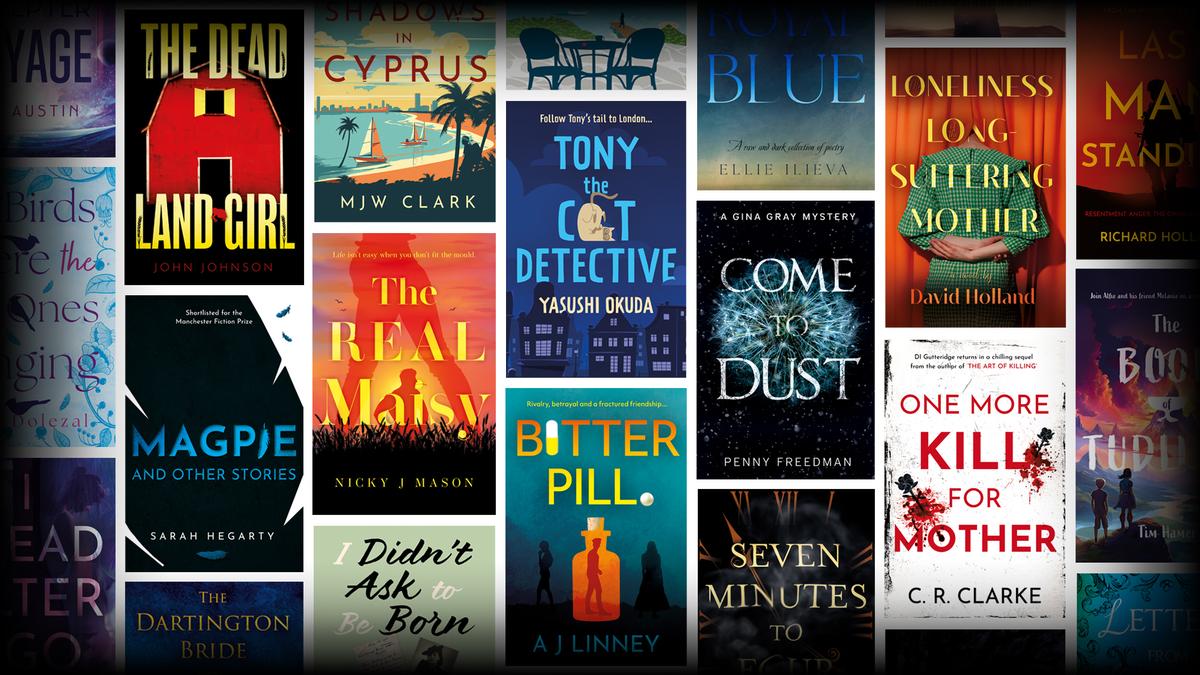
One of the key things to explore when thinking about the cover design for your book is its genre. For example, if your book is a crime fiction novel, you may well notice that the current trend for crime and thriller books shows covers using bold, sans serif fonts, and the use of shadow, imagery and textures to create a mysterious or ominous tone.
If you’re unsure of what the current look for the genre of your book is, the best place to start is by going to bookstores and taking a look at the books in your genre. Get a feel for the covers in your genre and take note of the fonts, colours, imagery and the style in which they are being used. You will start to notice common themes and trends.
Know Your Audience
Knowing the audience your book is aimed at is one of the most important factors to take into consideration when thinking about the look and design of your book cover. Who are the key readers of your genre? What age group will be buying and reading your book?
Some key elements to consider when thinking about your target audience are fonts, colours and imagery.
For example, if your book is a children’s fictional story, the cover will likely show brighter, more colourful imagery, and the imagery itself will likely be illustrative rather than photographic. The fonts used on the cover should be chosen specifically to suit a younger audience and therefore look more playful too.
Whereas if your book is an adult murder mystery story; the colours, imagery and fonts will need to suit the target audience for this genre. For an adult murder mystery book, you will often see darker colours being used on the cover, along with a sans-serif font and photographic imagery. Shadows are often used to give the feel of mystery and menace.
It’s always good to keep these three key elements in mind when thinking about cover ideas for your book.
How to Explain Your Ideas to a Designer
Having likely spent many months or even years perfecting a fiction or non-fiction title, many authors will become very attached to their book. This is completely natural, but it can make it hard to hand over the precious material to a professional designer and trust in them when it comes to starting work on the cover design.
Although it can be an enticing idea to keep your book close and try designing the cover yourself, or even have a close friend do it for you, it is important to consider the following:
- Do you or your friend have professional design experience?
- Do you have the right software to create a book cover?
- Are your ideas suitable for the genre and target audience?
- Will the end result look professional?
- And lastly, is a book with a self-designed cover likely to get stocked by a bookshop?
Book cover designers have a wide range of knowledge and experience and are industry experts when it comes to cover design. They will be looking to create something that will allow the book to stand out from the crowd, and gain retailers' attention (ensuring the book is likely to be taken on by bookstores), whilst also working to produce something that equally considers your ideas for the cover. Designers can advise you on whether your cover idea is possible, or they can give you ideas they think will work better.
While you may know your book inside-out after having poured over it for many months, your designer, naturally, will not. They will be working from a summary, blurb, and any essential information you pass onto them.
When describing what you’d like to see on your cover, it’s important to select a few key elements from your story that you wish the designer to convey on the cover. Whilst wanting to draw people in, you don’t want to tell the whole story on the cover. Leave plenty to be discovered inside the book! Something always good to keep in mind is the saying ‘less is more.’
Think about the size of a standard book cover. Is what you have in mind going to look too busy? One thing to remember is you’re looking to have a book cover created, not a movie poster. If you look at book covers across the genres, most covers will show one, two or three key elements that are important to the story. This allows the cover to say what it needs to whilst drawing the viewer in to find out more.
Another way to show a designer what you have in mind for your cover is by taking photos or screenshots of a book cover you like the look of in your book’s genre. Whether it’s a certain colourway you like, a certain style of imagery used, or even just some of the elements that appear on a cover; anything you think would work well for your book cover, take a photo of it. Doing this can help your designer understand what it is you have in mind.
The Realities of Sourcing Cover Material
When it comes to designing a book cover, there are many ways this can be achieved. However, if you’re looking to have this created by an in-house designer rather than a freelance illustrator, the likelihood is that they will be sourcing the imagery for your cover from websites such as Adobe Stock.
Websites like Adobe Stock provide a vast selection of high-quality images that allow designers to combine and edit where they like to create a cover that is unique for your book. This can be a much cheaper option yet just as effective a way of having your cover created than say going with a freelance illustrator, which will likely cost much more.
Book publishers must ensure that whatever imagery the books they publish use on their covers are free for commercial use and don’t have any copyright restrictions, due to obvious ownership complications and any legal issues that could arise because of it. Therefore, going with an in-house designer of a publishing company and allowing them to source the imagery for your cover design means you won’t have the headache yourself of ensuring the images used are copyright-free, or have any kind of licensing issues - they will be checking all of this!
There are of course many reasons you may wish to provide the imagery for your cover. Perhaps it’s a historical book and the imagery you’d like to show on the cover isn’t possible to source from a stock imagery website. Or maybe you’re writing a biography and have a photo you’d like to use on the cover?
In these instances, it’s important to check the following:
- Is the image you’re looking to use 100% copyright-free, or can you prove you own the copyright to it? It’s best to investigate this before supplying the image to a designer, as this is likely the first question you will be hit with to ensure it’s okay to use!
- Is the image you’re looking to supply high enough quality for industry-standard printing? Book publishers and printers alike usually require images to be supplied at a minimum of 300 DPI (Dots Per Inch).
- Is the way you’re planning to supply your image ideal for a book cover? For instance, if you’re looking to supply photographs for your cover, taking photos of photos isn’t the best way to go about it. Doing this can lead to reflections on the photos, lighting interference and blurred images. Scanning photos is the best way to provide this kind of imagery to a publisher – and of course, ensure you’re scanning them in at 300+ DPI!
Linking Series Books Together
If you think your book may lead to a sequel, or perhaps you’ve already written a series of books, it’s important to consider how they are going to visibly link together to show they’re part of a series. How will the reader know, besides maybe mentioning it in the blurb, that it’s the second book of the series? How will your set of books look lined up together on a shelf? What’s going to catch a customer’s eye and help them link your first book and your second, third, or fourth?
The most important factors to consider when thinking about how your book covers will link to one another in a series are colours, imagery, font and layout.
Selecting a specific set of colours you wish to stick to throughout your series is a great way to help link the covers together. This can often mean working with a reduced colour palette and allowing a different colour to stand out most each time for each cover.
Imagery is another key element to bear in mind. It’s good to continue the same style of imagery across your set of books. For example, if you’ve chosen a specific style of illustration for the first cover, it’s best practice to continue this same style across the rest of the covers in the series. The same goes for if you’ve chosen to use photographic imagery for your first cover. Switching to then use illustrative imagery for your second cover wouldn’t allow for the books to visibly link together as part of a series.
Font choice and the positioning of cover text are two of the final most important factors to consider for a series of books. You’ll notice that most books that are part of a series continue to use the same select font(s) across their covers, rather than chopping and changing to completely different font choices. The positioning of the author’s name is usually kept in the same place on the covers throughout the series, and the title is likely kept a similar size and similar position to the rest of the covers in the series too.
When a series of books is created without considering these four key elements, they can appear disjointed and not like a united book set. Customers won’t easily see that the book is part of a series, and this can lead to fewer sales and also mean retailers may not wish to take the book on.
DO judge a book by its cover!
The cover design of your book is as important a part as any in the book production process. What is the first thing any potential customer sees when walking into a bookstore or searching for a book online? The cover of course! It acts as the ‘shop window’ to your story. At Troubador, we take all of the above into consideration when designing a book cover. That old saying “Don’t judge a book by its cover” is simply not true - it’s the one thing almost everyone does when deciding on whether to purchase a book or not.


