15th January, 2025
5 min read
Book Cover Trends for 2025
Written by:
Hannah Cather
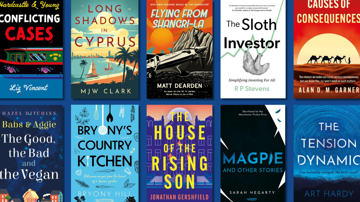
Book covers speak volumes. They grab readers’ eyes (and wallets) and have the power to capture the crux of the 80k-plus words behind them. This is all well and good until you’re the author or designer and you’re way back at the brainstorming, befuddled stage, umming and ahhing over what exactly your book cover should look like. It’s overwhelming to pin down which idea to choose, or even to whittle down the possibilities. This is why it can be so useful to research cover trends and tropes and see what’s dominating the bookshelves at a particular time – after all, covers are just as prone to popularity spikes, fave looks and fun fads as the flip-flopping fashion world.
So, if you’re an author considering a cover idea for 2025, read below for some of the trends to look out for this year. Take note, take inspiration and take cover in case an idea for your cover hits you square in the face – metaphorically speaking.
Abstract Minimalism
Main features: Bright colours; bold design; abstract shapes and symbols; big interplaying typography.
This book cover style was very popular in 2024, so it’s likely that you’ll have seen it on plenty of bookshelves already. These covers are low on content and detail, but heavy on impact. Simplicity can be so effective in covers because they provide undeniable focal points for the viewer. These covers are also not afraid of negative space – and why should they be? Negative space is just as effective as having lots of ‘stuff’ taking up all of the room. Covers in this style are attention-grabbing and loud in their subtlety, with the ability to catch the eye and breath of the buyer.
Gothic / Dark Academia
Main features: Ornate details, muted and moody palettes, spidery typography, and traditional Gothic animals such as ravens, crows, and bats.
The Gothic cover look is having a revival (cue joke about it coming back from the dead or being brought back to life). This style is dark and mysterious; the mood is ominous and foreboding. There are shadows and murky corners. Lighting is minimal apart from moonlight or, at most, starlight, and buildings are churches with scatterings of dilapidated gravestones, or grand Goth mansions with a single light on in the attic. Dark Academia likes to use the motifs of dusty books, dimly lit libraries and empty classrooms on their covers, embellished by lush textures. Classical art works well here, too – which always looks brilliant with modern typography slapped right across it in a startling juxtaposition.
Pure Typography
Main features: Text, strong design and not much else.
Let me be clear: by ‘pure’, I mean completely ‘pure’ – as in, nothing but text on a flat-as-a-pancake background. To make this work, the fonts and style need to be bold and large, or very interesting. At most, it can be fun to use a little motif to dot an ‘i’ or cross a ‘t’ or swing from a ‘y’, but only if the motif means something to the book and isn’t purely decorative. And decoration must be no more than this, else the stark and raw simplicity of text on a background is quickly diluted. Hand-drawn lettering can look very beautiful, too. This cover style trusts that the title, the author’s name and the colours are strong enough to do the talking, so make them shout loud. Less can definitely be more.
Genre-defying Twists
Main features: Surprises and shocks.
Expect the unexpected and be ready to think outside the box with this one. These are covers that go against the unwritten ‘rules’ of their genre’s aesthetic. For example, imagine a usually fluffy Romance cover with dark tones and blood splatters, a tense Thriller with a jolly, sunlit scene, or a terrifying Horror with florals and sparkles. This technique is actually rather clever because if you make a book look wildly different and alien compared to its neighbours on the bookshelf, you’ve made it *very noticeable indeed*. You’ve basically done the impossible: helped it to stand out in today’s super-saturated shelf space.
Cool Nostalgia
Main features: Bright, blocky colours; retro designs and fonts; striking backgrounds
This cover look takes a meander down memory lane, but not so far down it that it becomes completely uncool and out of touch. It cherry-picks the best bits of the past and revitalises them for today’s readers. The 60s, 70s, 80s and 90s are the inspiration here, bringing a kaleidoscope of bright colours, geometric shapes, bold visuals and square typography to the covers of 2025. It’s old-school without being crusty or cringy – and it must be ensured that it’s brought up to date without losing the authenticity of its origins.
Collage Core
Main features: Layered images and snapshots, textured backgrounds
A perfect choice for the covers of memoirs or non-fiction (except, of course, if you’re going down the genre-defying cover route), this look is scrappy, scrapbooky and layered. It usually uses snapshots of images, photographs, textures and backgrounds (maps, old letters, music scores), which are then artfully cut and pasted together around each other and on top of each other. This cover look is a bit of a dichotomy, in that it could quite easily go down the vintage-aesthetic route (think Granny’s scrapbook), but it could also end up with a super-modern vibe, depending on the typography, the placement, the art style of the fragments, and the thrust of the cut-and-paste.
Conclusion
Covers nowadays have a difficult task to fulfil. They must stand out, but fit in. They must comply but be unique. They must represent the interiors without giving too much away. They should be interesting and engaging. They need to work digitally and physically and be equally impressive when viewed as a thumbnail on a screen or in a reader’s fleshy hands. Covers must be everything, without being too much. It’s a tall order, but a very fun one to bring to fruition, with much joy to be had in the gritty initial research, working out what will work and testing out lots (and lots) of ideas. Just have a go, see what works and (please) enjoy the process. Hopefully, these 2025 trends will provide a little bit of inspiration for your own cover-to-be.
The Troubador team are here to help authors in any way that we can with no obligations, so please feel free to reach out to us if you have any questions. If you need illustrations for your book cover or interiors, we work with a roster of brilliant illustrators and can help you design the perfect cover to fulfil your vision - just click the banner below to get started. We’ll look forward to hearing from you – paintbrushes, pencils and plans at the ready!


